

PROBLEM
Delay in pick-up times coupled with cancellations and unstable charges, when using rideshare platforms result in serious consequences and frustrations for the user.
TOOLS
Adobe XD
ProtoPie
Adobe Photoshop
Adobe Illuastrator
TEAM
1 UX Designer
USER STORY
The user journey is based on the persona activity. Generally, all users perform the same tasks with rideshare. The Uber driver James is always anxious to get rides and to give the best satisfaction to his riders by picking them up on time and dropping them off at their destinations. The worker Koffi is always finding ways to get his ride to pick him up on time and arrive at work early to attend his morning meeting. The Season Booking app allows Koffi to request a ride that will be available every morning to pick him up to work and pick him up after work to the house. The Driver assigned to the Season Rider is on time to pick up the rider and drop them off at the destination every day, throughout the booking season.
USER FLOW - RIDER
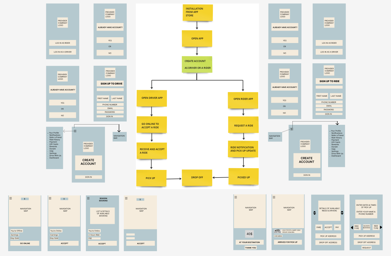
Two user flows. One for a rider, and one for a driver. Each of the users has three flows. Existing user, a New user, and a Season user. The product is designed for the six flows.

PROTOTYPE LINKS
DESIGN
I made all my design decisions based on the user stories. Brainstorming many solution ideas produced the information architecture that resulted in initial paper sketches of ideas, that will bring improvement to the current rideshare app to reduce the rider users' wait time, and pay a stable fare for the rides.
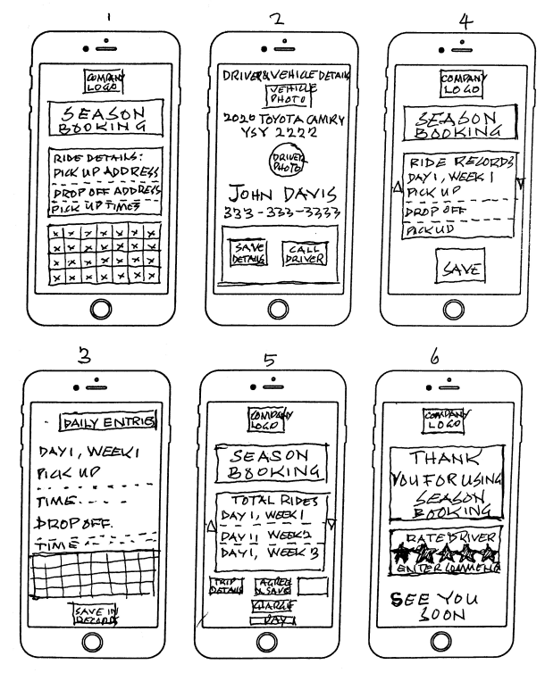
IDEATION & INITIAL SKETCHES
RIDER


DRIVER

INTRODUCTION
Rideshare services have become increasingly popular, providing a convenient and accessible transportation option for many. However, riders encounter various problems when using the rideshare platform, hence, the need for a solution, to improve the commuting problems in our community.


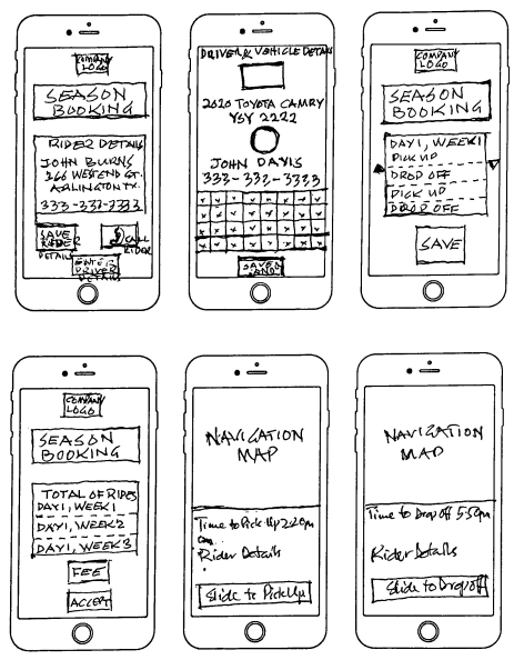


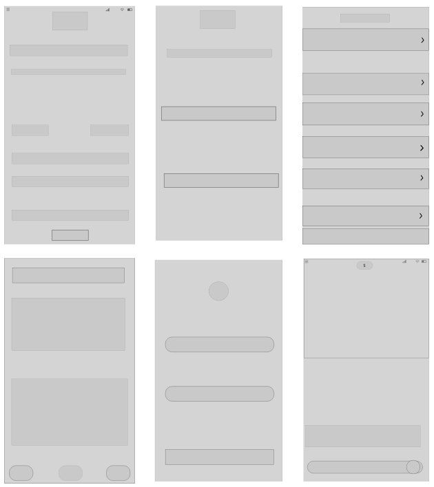
DIGITAL FRAMEWORK - LOW FIDELITY
After brainstorming and juggling with sketches, based on the Information Architecture, I created the digital framework for the product showing the position and arrangements for the components and elements for the interface.

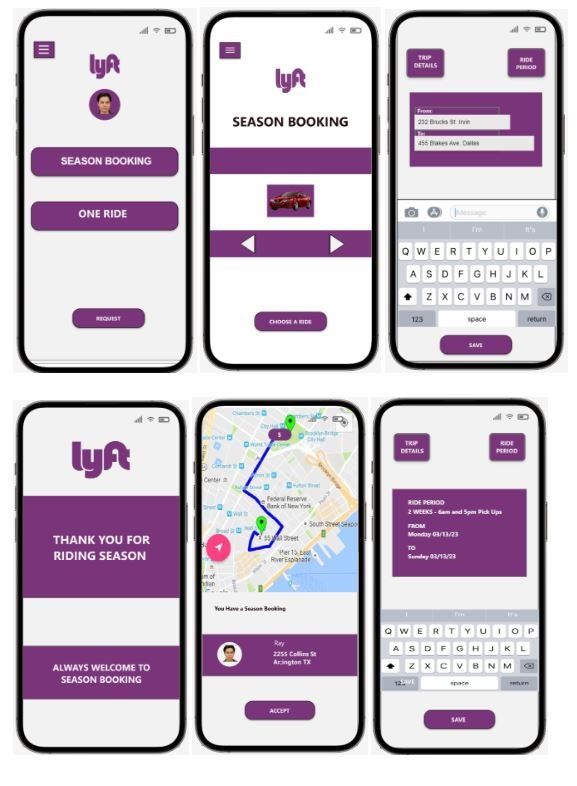
HIGH FIDELITY DESIGN
Introducing color and details of the components and elements into the digital framework created a High Fidelity Design for the product.

HIGH FIDELITY MOCKUPS
I applied the standards, using WCAG guidelines to ensure good contrast and hierarchy for the interface, to enhance the app's easy, successful, and satisfying use. Typography was tested to ensure eligibility of fonts The High Fidelity Mockup has the design ready for Prototyping.

PROTOTYPE
The High Fidelity Mockups are imported into ProtoPie for prototyping. The process revealed some flaws and blocks to the swift transition of screens and flows. This means further improvements and corrections with Adobe XD and the ProtoPie tool to achieve a good working product.
https://cloud.protopie.io/p/09b5e7c0ad33a763ed873050
https://cloud.protopie.io/p/826466ab450dc1d3ec91f8f4
https://cloud.protopie.io/p/486c2d809e1d506b6a7c1768
https://cloud.protopie.io/p/91173174b57c3e921a23ecf2
https://cloud.protopie.io/p/921173df1cf7cd6b07f45ff9
https://cloud.protopie.io/p/09b5e7c0ad33a763ed873050
PROTOTYPE LINKS
USABILITY TESTING
Five moderated and one unmoderated test revealed three important issues
Users needed more login options on the start screen
Users could not understand some of the on-screen instructions easily
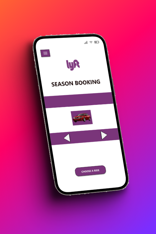
Some participants were anxious to know the vehicle type they chose for their ride.
The issues were resolved with new instructions that were easily understood in the second round of Usability Testing. The list of available vehicles is replaced with photo images of the cars, for the user to scroll through and select the vehicle of choice. I retained the login options in the design to avoid congestion of the screen, All the participants had the login information for at least two of the options available on the screen.
REFLECTIONS AND LEARNINGS
The user interview revealed the behavior of the users.
The actual cause of their anxiety became obvious.
Participants expressed their interest in the new introduction.
The new system eliminates the need to go on the phone every day to book a ride.
IMPACT
Users are anxious about the Season Booking. It will save the users time and money.
I am very grateful for the opportunity to work on this project.
THANK YOU.
callistus dogbatse-akakpo - Springboard USF.
MY ROLE
User Research
Usability Studies
Wireframing
Mockups
Prototyping
Usability Testing
Iterations
USER RESEARCH
Questions for the research are based on the general experiences of users and the participants are chosen from across the demographics, who are all regular users of rideshare, including a permanent driver with a rideshare company. The participants included two workers, a rideshare driver, and a working mother and her 19-year-old son, who uses Uber to travel to college every day. Persona ages range between 19 and 42 years.
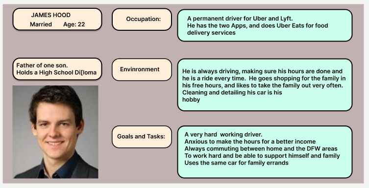
USER PERSONA
I created Personas from the regular users who have vast experiences in using rideshare. The information in their answers to the research questions encouraged me to make many design decisions to ensure the right problem is answered.


USER FLOW - DRIVER

GOALS
The aim of designing the new system in the app includes:
To provide UI screens for a rideshare company of my choice
The screens reflect the rideshare company brand.
UI to enable user riders to request a SEASON BOOKING
Screens to enable user drivers to receive requests for a SEASON BOOKING
Introduce the option for riders to choose the type of vehicle to request for the ride.