
INTRODUCTION
In the ever-evolving landscape of entrepreneurship and investment, digital platforms that connect founders and investors play a vital role in fostering innovation and economic growth. These platforms bridge visionary entrepreneurs seeking financial support, and seasoned investors searching for promising ventures. As the entrepreneurial ecosystem continues to evolve, so must the tools and platforms that support it.
PROBLEM
Founders of small startups need a user-friendly guide for uploading & publishing their pitch deck on the Scroobious platform to increase the number of successful uploads and publications, thereby improving their chances of securing funding for their startup
GOAL:
To increase the percentage of founders on the Scroobious platform that upload and publish their pitches after completing the Learn Pip modules.
TOOLS
Figma
Photoshop
Illustrator
Miro
TEAM
3
MY ROLE
Heuristic Analysis
User Research
Sketching
Wireframing
TIMELINE
4 Weeks
COMPETITORS
The team studied other competitors who use a digital platform for founders and investors, to gain more understanding of their interactions with the platform and find out the aspects of the process that encourage founders to publish for investors to view and to secure funding for their business.
The team worked through the platforms of:
Start Engine
Angel Invest
Angel Invest Network
HEURISTIC ANALYSIS OF SCROOBIOUS
Feedback after in-depth studies of the Scroobious platform shows what the founders do and what they need for a better experience on the platform

USER RESEARCH
User Research was conducted with three users on the Scroobious platform. Samuel is now creating his Pitch Deck. Paul created and uploaded his Pitch Deck but not the Video. Oni has created, uploaded, and published her pitch. The three participants are at different levels of using the Scroobious platform, to enable us to receive feedback from different experiences.
SYNTHESIS
All users noted, in some form, a lack of clear additional motivation/encouragement to
upload & publish their pitches. Several users also commented on the “blank” screen
when they clicked “Reach Investors” on the top navigation bar, and another said there
seemed to be a disconnect between the founders & investors.
RECOMMENDATIONS
Based on this, we believe redesigning the Reach Investors page with investor
information or statistics about startups funded after publishing would be one way to
begin addressing this issue. Additionally, adding success stories and other news about
recent funding, etc, to the Dashboard would have the same effect and increase its value
before publishing. Users shared their appreciation of the Resource center.
AFFINITY MAPPING
Affinity Mapping is created by grouping the findings into four categories:
Motivation
User Flow/Layout
Desired Features and Functionality
What’s Working.
The Affinity Mapping made it possible to discover the areas of priority, to work on, as reflected in the evaluation.

Synthesis of User Research findings provided the team with information on what’s working well on the Scroobious platform application and the pain points for the users that need to be addressed. The pain points are grouped into three categories to generate ideas for solutions to the stated problem.
What’s Working:
Learn Pip Lesson Contents
Well-organized Module Structure
Resource Center
Pain Points Synthesis:
Motivation
Concern: Lack of motivation to upload and publish pitches & a perceived disconnect between founders and investors.
Recommendation: Redesign the Dashboard to include post-publication startup funding statistics and success stories.
User Flow & Layout
Concern: Unnecessary items on top navigation and lack of information available on the video upload screen.
Recommendation: Combine “Craft Pitch” and “Publish Pitch,” including publishing as the natural & expected end point of building a pitch. Provide technical information in video flow.
Desired Features & Functionality
Concern: Published users experienced a lack of post-publishing clarity, struggled to find the dashboard, and desired more editing options.
Recommendation: Modify the pitch publishing screen to celebrate pitch publication, including investor side view and pitch deck/video editing.
User journey of users on the platform application enables the team to create a meaningful and usable design that will help the users achieve an improved experience, and for the platform to record a higher number of founders who create, upload, and publish their pitches.
User Flows


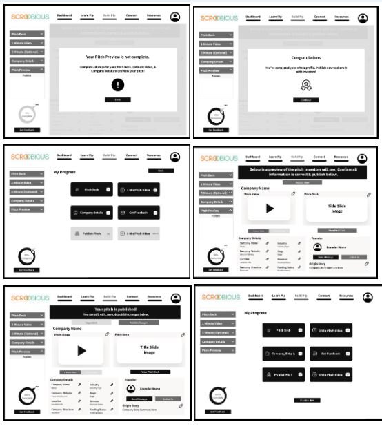
DIGITAL WIREFRAME
Based on the initial sketches, the team created the digital framework for the design to show the position and arrangements of the components and elements that will enable easy an and smooth interaction with easy workflow.


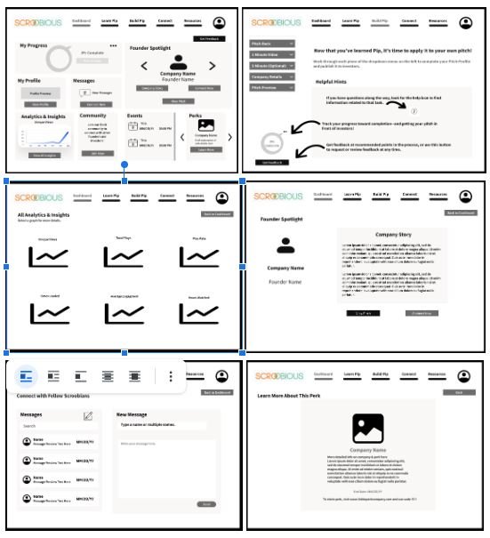
LOW-FIDELITY WIREFRAME
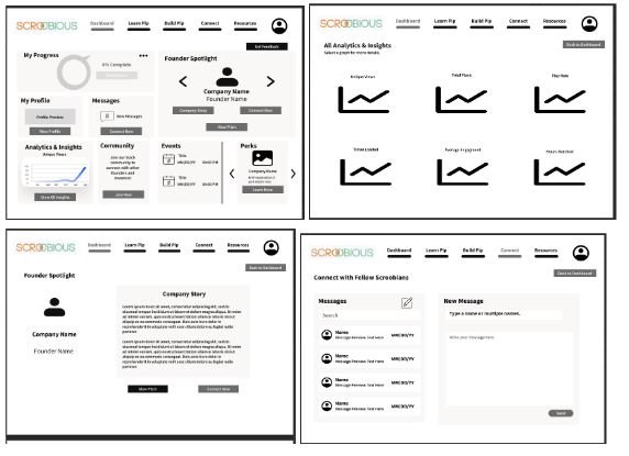

PROTOTYPE 1-DASHBOARD


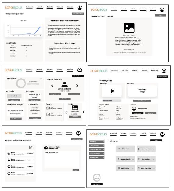
PROTOTYPE FLOW 2-BUILD PIP

USABILITY TESTING
Due to time constraints, we were unable to complete usability testing with our revised low-fidelity wireframes and turn them into high-fidelity wireframes
RECOMMENDATIONS
Conduct usability testing, with an incentive for participation
Create high-fidelity versions of any components of the redesign the company decides to implement
Conduct A/B testing with the redesigned additions and the original site to determine the impact of changes on upload and publishing rate.
REFLECTIONS AND LEARNINGS
The skill of collaborating with a team, and with stakeholders.
The components and features that are useful to users on a fundraising platform
The usefulness of iteration in the design process, with constant brainstorming to arrive at the desired workable solution
ACCESSIBILITY
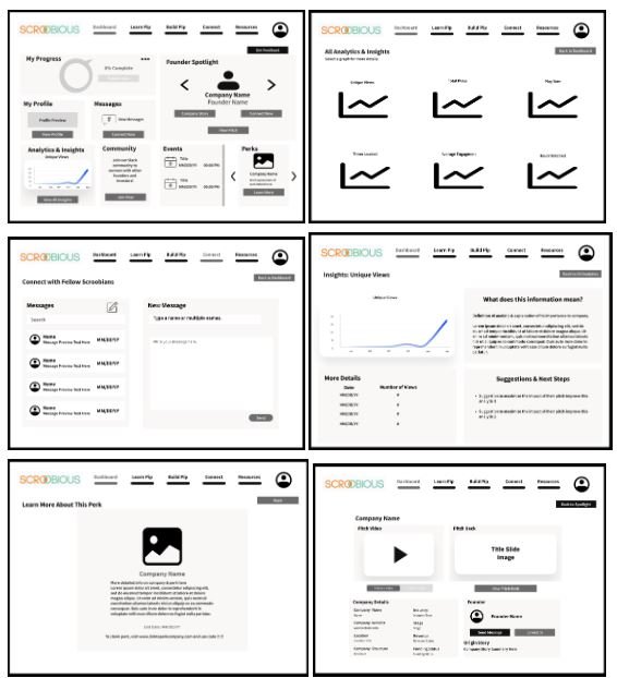
Based on the insights gathered from interviews, to help users as they build their profile we added a help icon that incorporates the Scroobious logo.
Redesigning the Help Icon: Given the suggestions from the team and our pre-knowledge of universal icons, we simplify our original design, all while maintaining the same uniqueness. Now the icon resembles the progress bar with a question mark inside
Reorganizing: To motivate users to publish, we moved the progress bar with analytics and insights. First User State/Empty State: We created an empty state to increase learnability with the platform and to drive the user to complete necessary tasks. Community Section: We removed links to specific topics on Slack and instead created a direct action button to join the Slack channel.
Based on the insights gathered from interviews, our initial Dashboard Screen included analytics and insights, a founder spotlight, a progress bar, events/perks, and a link for community topics on Slack.
UI DESIGN
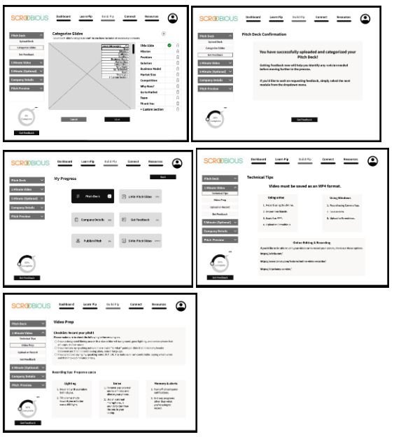
The UI Design is improved by reducing items on a page to allow users easy access to information.
Drop-down menu: To declutter the user interface, we introduced a drop-down menu that allows users to conveniently access and edit their pre-published screens.
Consistency: To maintain consistency with the existing Scroobious platform, we kept its original company details and founder containers.
Action Buttons: To motivate users, we moved the action buttons to enhance user engagement. "Get feedback" and "publish now" are strategically placed in easily accessible areas.
IMPACT
As stated in our Next Step statement, due to time limitations, we suggested conducting A/B testing with the redesigned additions and the original site to determine the impact of changes on upload and publishing rate.