

Introduction:
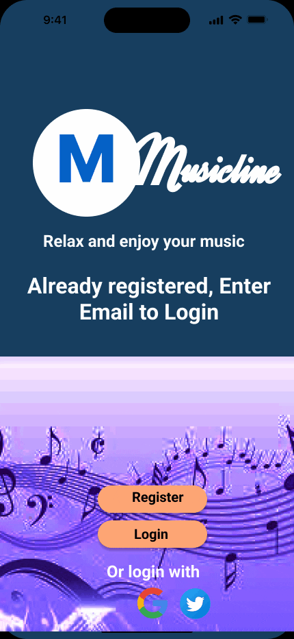
Musicline is a media company specializing in producing music to be available to users anytime and everywhere. Due to the importance and benefits of music to the human body and health, their product has become very popular and user subscription is increasing at a fast rate. The existing product allows users a free period, to subscribe when it expires, and that needs to be improved to enable users to subscribe upon registration.
PROBLEM:
With increasing popularity and a record number of users, Musicline needs improvement on their existing app that will enable users to subscribe upon registering to use the app and to encourage existing users to subscribe.
GOAL:
To come out with a design that is easily accessible by all the user groups.
A design to be interactive with suitable buttons, labeled areas with text and images
To come out with a product that enables users to achieve their maximum and best experience by subscribing to the services.
Tools:
Figma for wireframing and mockups.
ProtoPie
Photoshop
Illustration
Team:
1 UX Designer
Timeline:
Discovery and research - 60hrs.
Design and testing - 35hrs
Overall - 95hours
My role:
User research
Usability studies
Wireframing
Mockups
Prototyping
Testing and iterating design
I started looking at some of the leading musical app products on the market to get an in-depth idea about music apps, the way they perform with the features in them, and how easy they are to use, to achieve goals.


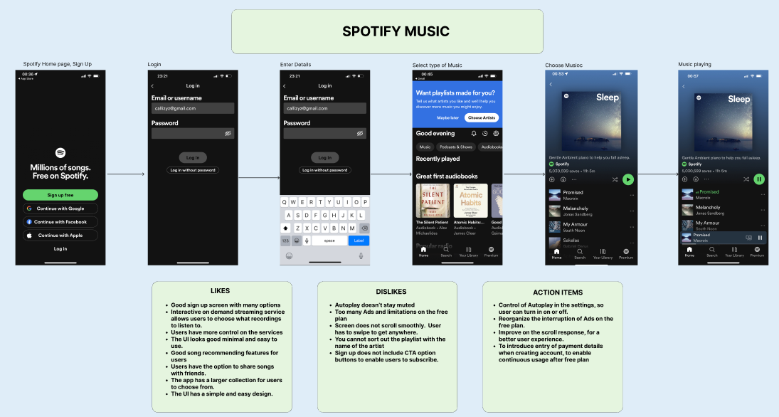
Critical observation, registration, and subscription to these leaders in the market for in-depth information to understand the processes and performance of a musical app.
User Research:
User research was conducted and moderated in person with five participants. Mike, 28, Sam, 20, and Esther 23 are my colleagues at work and we conducted the meeting in our company meeting room. I interviewed the other two participants, Ruben, 18, and Nick, 34, in my apartment, as they live in my neighborhood. Each interview session was scheduled for 20 minutes, and participants performed well, and on time.


Research questions:
Research questions were prepared to enable me to understand the users, and the participant’s answers to suggest ideas for a product that will allow users to subscribe to the services they enjoy.
Questions for this interview are as straightforward
What factors would encourage you to try a subscription for a mobile music app?
What would make you continue or cancel a subscription after a trial period?
What would make a music app stand out from the competition and make you switch?
User Personas
Personas for the user research are Ruben, 18, Esther, 23, and Nick, 34.
Ruben is a college student in Arlington, TX. Always listens to music on his phone.
Esther is a part-time employee at my work and a university student in Fort Worth. She has a paid service from YouTube. She likes listening to all types of music, especially, Jazz, Blues, and Reggae.
Nick is a worker at Staples in Mansfield, TX, and he lives in Arlington, TX. He has a subscription plan with Spotify and a free account with Pandora. Nick's favorite is R&B, and he loves dancing


User flow:
A user flow is created for Nick, based on the basic process of login, creating an account, and using the app to search and listen to music

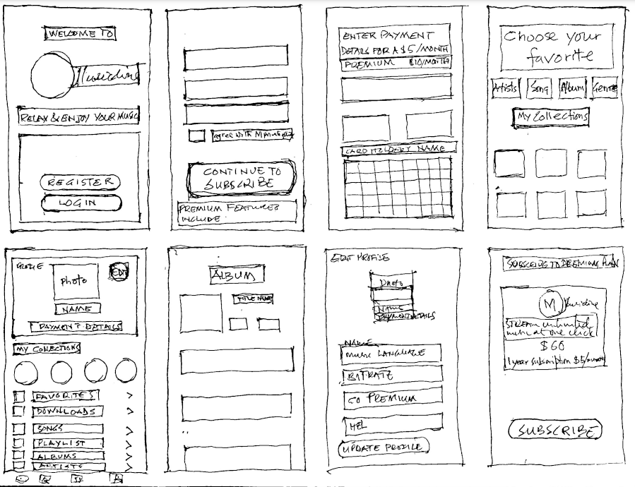
Initial Sketches - (Paper Wireframing)
Studies of products leading in the market, and information gathered in the user research provided the ideas for the information architecture and sketched out possible solutions to the challenge.
INFORMATION ARCHITECTURE


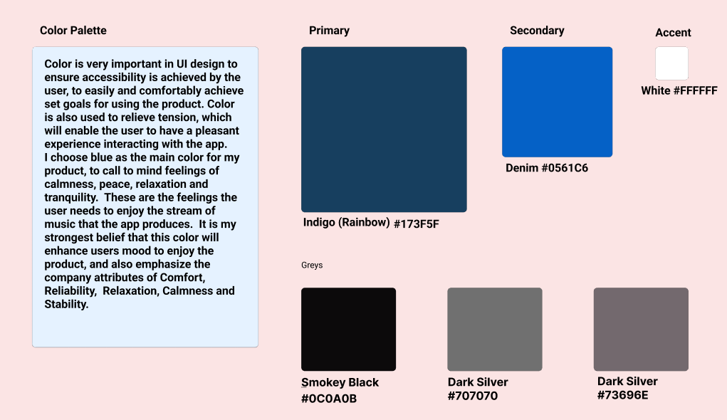
COLOR PALETTE

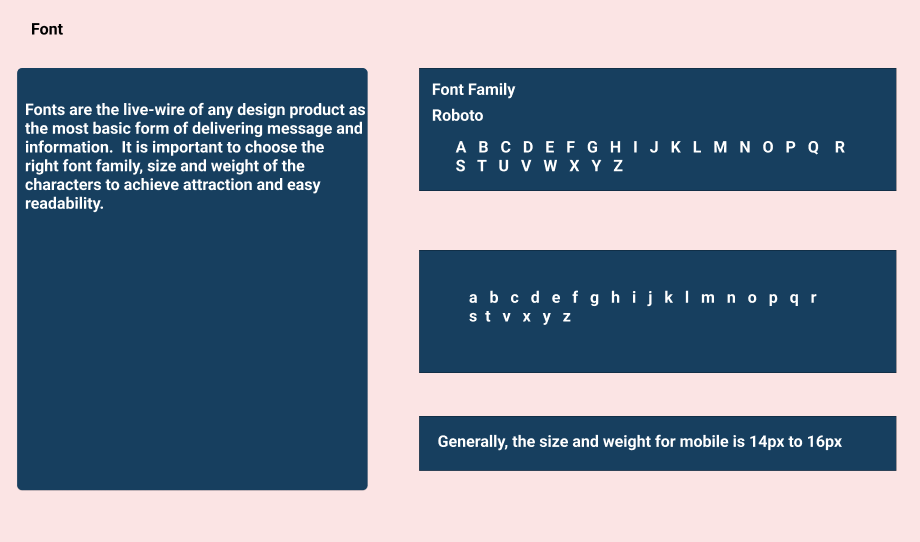
TYPOGRAPHY
Low Fidelity - (Digital Wireframing):
Developing the sketches into a digital wireframe to provide the space for components, elements, icons, and typography for a high-fidelity design for the product. Created in Figma.

Guerrilla Testing:
Guerrilla testing to ensure the viability of the design and provide ideas from the feedback for improvement into a high-fidelity design.
High Fidelity:
Using resources from figma-ios-kit to create and input color, typography, components, and elements to represent a completely working product.

Usability testing:
High-fidelity Usability testing is conducted to assess the workability of the product.
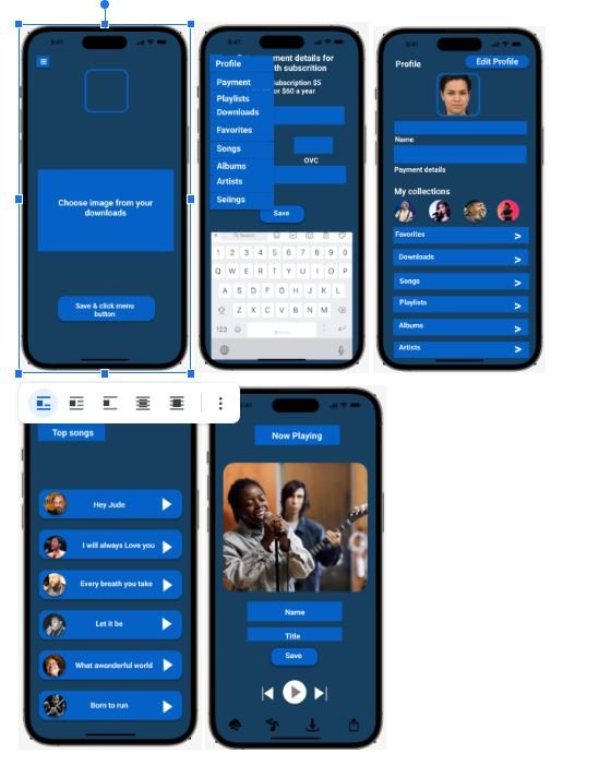
High Fidelity Mockup:
Introduction of extra images and scrolling, an improvement on the registration, subscription, and photo upload pages produced a mockup, ready for prototyping

Guerrilla Testing:
The initial guerilla test was on the low-fidelity design. Five participants, between the ages of 18 and 20 tested the product for twenty minutes each. Testing results suggested improvement on the login screen and making subscription and premium plans clearer for users to know the difference.
Usability Testing:
Usability was conducted on the high-fidelity design to ascertain the workability of the design and to mockup for prototyping. The five participants, between the ages of 18 and 34 performed tasks for twenty minutes each, to find out how the product performed, what to include, and what to take out to make the product easy to use and enable users to achieve their goals.
Issues:
Guerrilla testing participants found:
The initial loading time is acceptable but some suggested it could be improved for smoother boarding,
Most participants wanted to know the difference between subscription and premium plans.
Navigating from the home screen to the song library was generally intuitive but some participants took some time to locate the buttons
Usability testing revealed that:
The app is user friendly and the onboarding process is smooth
Music discovery features received praise for aligning with the user’s preferences.
Premium features and subscriptions were presented clearly
Additional features in the premium plan generated positive feedback.
Prototyping:
ProtoPie tool created a high-fidelity product that performed well, especially in the login, and registration to use the product, and the users revealed several positive aspects of the product.

LINK TO PROTOTYPE
Accessibility:
The app is designed for mobile phones and to be accessible to all user groups. The interface design is user-friendly with suitable buttons and clear user instructions
UI Design:
I applied WCAG standards to ensure the UI Design gives users that relaxed mood to enjoy using the product for maximum satisfaction, as reflected in the choice of color palette, with accent colors to bring focus to important areas. The typography is clear and bold.
Impact & Learnings:
Users gave positive reports on using the product. It is easy to use and enjoyable. Allowing them to subscribe on registration gives a feeling of belonging to the service, and part of the product. Using the Figma tools for the designs brought in new lessons of learning how to play music on the high-fidelity prototype. Had to use Photoshop to improve on images for the app. I used Illustrator to create the logo for Musicline. Finally, this project made me see how important music is in the life of every life group and can be a lucrative business when tailored to users’ tastes
Thank you for reading my Case Study